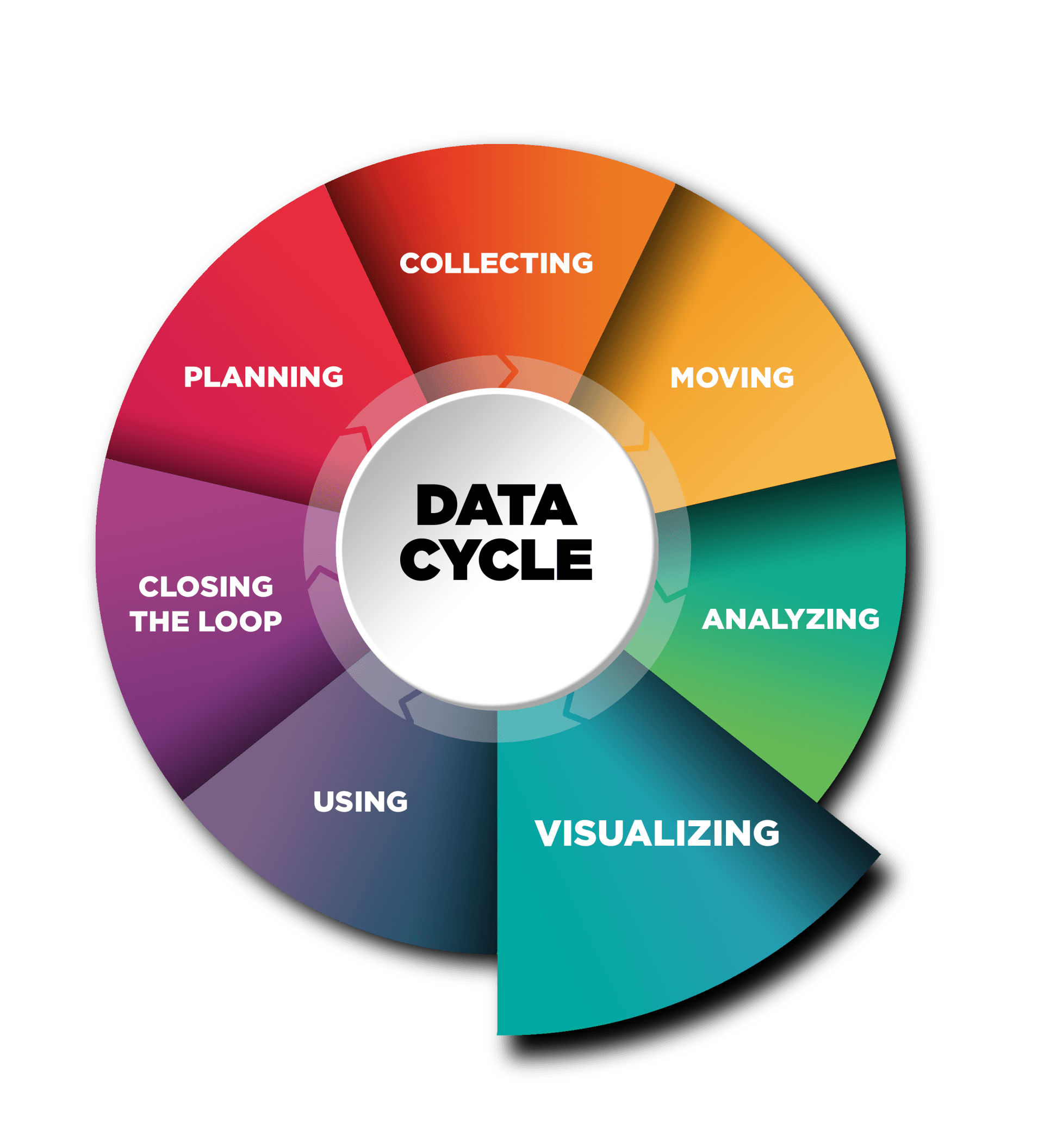
Visualizing
Essential Question
How will we visualize the data to make it digestible and meaningful to stakeholders for improved decision-making?
Who is Involved
Faculty and Data Lead
Enabling Conditions
You have analyzed your data and are ready to present it to stakeholders
Data visualization is an excellent method for communicating rich and complex data in a way that is simple, understandable, and engaging. Effective visualization will draw the audience into the discussion and prompt insightful questions and discussion. Graphs, charts, and more creative methods of communicating data allow participants to spend their energy on understanding the implications of the data rather than trying to interpret it. However, the goal of data visualization is not to be slick. The primary objective is to ensure that data is being communicated effectively to multiple stakeholders in appropriate and meaningful ways. Making sure that those that need to understand the data are able to do so quickly should drive the development of visualizations. Whether those stakeholders in the room are program leadership, faculty, or district personnel, visuals should be relevant and easily digestible. Additionally, whether participants are statistically savvy or novices, visuals should be understandable and promote context building for how to improve core aspects of the candidates’ development. Visualization has the power to equalize a room full of people and give each individual an opportunity to draw their own conclusions, provide additional data/context, and make valuable recommendations for how to shift programming and/or candidate development.
Below is a list of US PREP’s Top 5 guiding principles for developing visualizations:
- Accurate- Before any visual is used or available to the public, the data should be checked and double-checked.
- Sufficient- Visualizations need to be able to stand on their own. If someone needs to explain the charts or provide additional information, then the visual was not effective.
- Meaningful- Visualizations should be useful for decision-making. If a visual doesn’t do this, or worse yet, makes this harder, then it wasn’t a good visual.
- Engaging- Visualizations should be aesthetically pleasing, interesting, and goal-oriented. The visuals that a program uses should drive richer conversation than the data alone.
- Simple- Visualizations are best when they are easy and quick to understand, not cluttering the screen, and accessible to broad audiences.
To assist with considering all of these issues as well as a framework for visualizing activities, a few examples have been provided that a program can reference that demonstrates the use of these guiding principles.

Why is visualizing data within the cycle essential to DEI?
The resources
Do No Harm Guide: Applying Equity Awareness in Data Visualization by the
Urban Institute highlights various considerations when visualizing your data in an equitable way. Be sure to review this resource when developing and adjusting your visualizations.
Pause and Process
At the end of each section of the US PREP Data Toolkit we will ask a few brief questions for you to consider on your journey. Once you have completed all the Pause and Process Sections, you can continue to the next step in the Data Toolkit.